
info@artecno.net

+39 041 5952250

+39 041 5952250
")
")
info@artecno.net
+39 041 5952250
+39 041 5952250
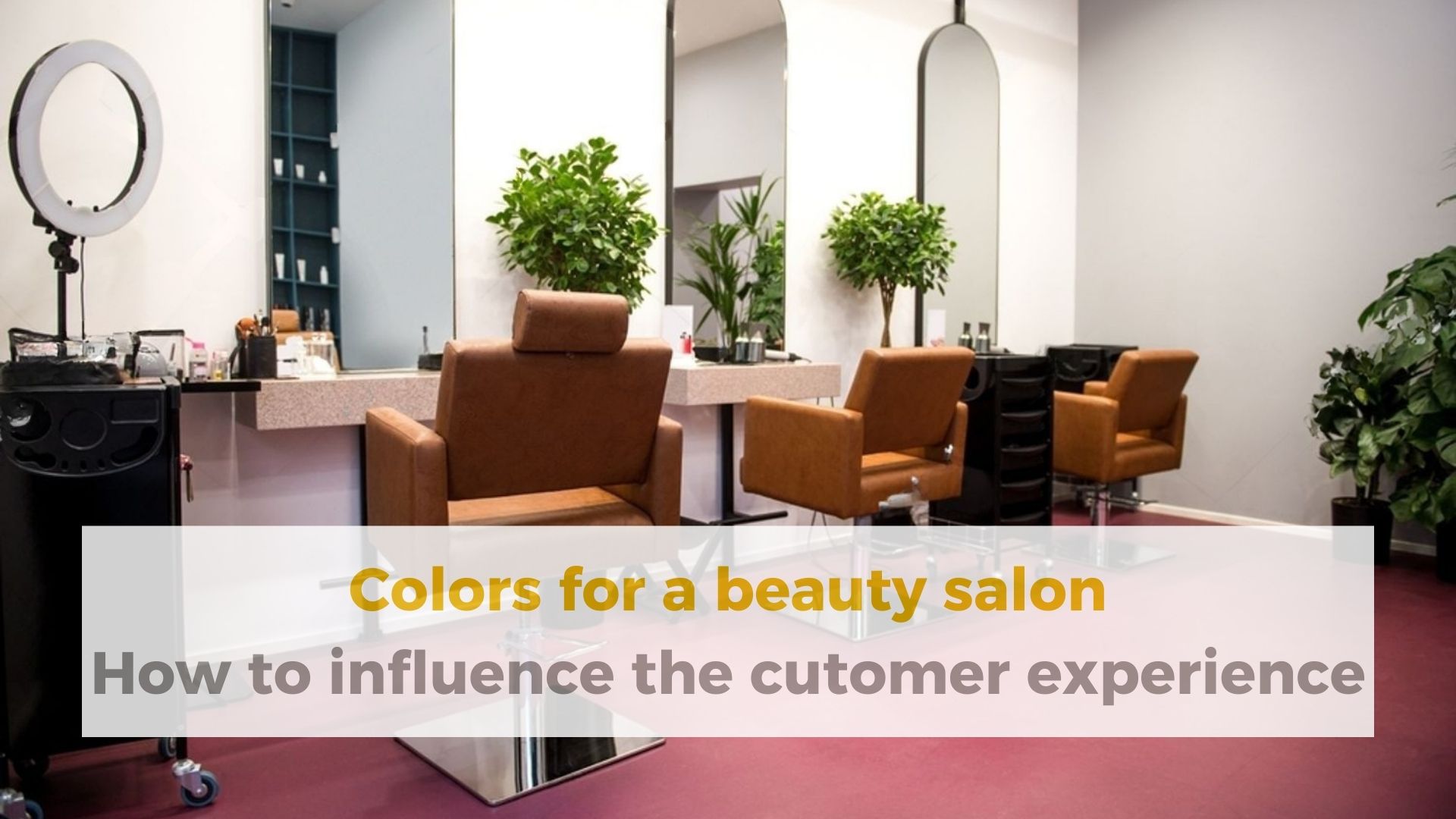
Setting up a beauty salon isn’t only about the functionality of the furniture—such as trolleys, chairs, and manicure tables—but also about the atmosphere it conveys. The real key to an unforgettable experience often lies in a subtle yet powerful element: color.
etting up a beauty salon isn’t only about the functionality of the furniture—such as trolleys, chairs, and manicure tables—but also about the atmosphere it conveys. The real key to an unforgettable experience often lies in a subtle yet powerful element: color.
At Artecno, experts in professional salon furnishings, we know that every chromatic detail helps define your brand identity and, most importantly, influences your clients’ mood.
Let’s explore how to choose the right colors for your beauty salon and turn it into an oasis of wellness and style.
Your beauty salon is a place where clients seek relaxation, self-care, and transformation. Colors in a beauty salon are not just decoration—they are true tools of sensory marketing.
A well-considered palette can:
Create the right atmosphere: instantly defining whether the space feels relaxing, energizing, luxurious, or minimalist.
Influence spatial perception: making a room appear larger, cozier, or brighter.
Increase comfort: colors can reduce client stress and anxiety, preparing them for treatment.
Strengthen your brand: the chosen colors become a core part of your visual identity, helping you stand out from the competition.
Understanding color psychology is the starting point for choosing the right colors for a beauty salon. Each shade evokes specific emotional and physical reactions:
|
Color |
Emotions & Perceptions |
Use in a Beauty Salon |
|
Blue |
Calm, trust, stability, serenity. |
Ideal for relaxation areas, massage rooms, and hydrotherapy zones. A truly relaxing color for beauty salons. |
|
Green |
Balance, nature, health, growth. |
Perfect for wellness areas, organic treatments, or the entrance for a fresh feel. |
|
White |
Cleanliness, purity, minimalism, hygiene. |
Used as a base (walls and ceilings) to open up the space and reflect light. |
|
Purple/Mauve |
Luxury, spirituality, creativity. |
Darker tones add elegance; mauve offers a feminine, relaxing touch. |
|
Soft Yellow |
Optimism, energy, joy (use sparingly!). |
Great for small accents in waiting rooms to create a sense of welcome. |
|
Grey/Taupe |
Neutrality, sophistication, modernity. |
Excellent as an elegant base for furniture and flooring; pairs well with any accent color. |
Wellbeing is the primary goal, so relaxing colors should dominate your palette, especially in treatment areas.
Ocean and sky tones: dusty blue, pastel turquoise, soft petrol blue. These colors can lower heart rate and blood pressure, preparing the body for relaxation.
Earth tones: taupe, warm beige, sand, light terracotta. They create a sense of safety, stability, and grounding, recalling natural and luxurious materials.
Sage and mint green: soft greens are proven to reduce eye strain and muscle tension, connecting the environment to nature.
Artecno Tip:
When choosing accessories like service trolleys or stools, opt for neutral colors (white, grey, black) if the walls are vibrant. If the walls are neutral, add a pop of color through seating or our manicure tables for the perfect accent.
Have you seen the Artecno trolley range yet? Take a look.
Wall colors in a beauty salon should be selected based on the function of each individual space:
1. Reception and Waiting Area: The Welcome Zone
Goal: create a strong first impression, inspire trust, and promote calm.
Ideas: a neutral palette (light grey, off-white, taupe) paired with a warm, sophisticated accent color (copper, deep dusty pink, emerald green).
2. Massage and Treatment Rooms (Relaxation)
Goal: maximum tranquility and rest.
Ideas: use predominantly relaxing shades such as dusty blue, sage green, or warm beige. Avoid bright, intense colors.
3. Manicure/Pedicure and Make-up Stations
Goal: clarity, precision, and brightness.
Ideas: white or very light grey as a base to maximize light (essential for detailed work), with a touch of a gentle energizing color in the furniture or décor.
Harmony is achieved when color, light, and materials work together:
Leverage natural light: if you have large windows, light colors will reflect light and expand the space. Dark shades absorb light, creating a more intimate atmosphere—ideal for massage rooms.
Light temperature: warm LED lighting (below 3000K) enhances earth tones and creates a welcoming atmosphere. Cool lighting (above 4000K) is crucial for make-up and precision treatments but may dull wall colors.
Natural materials: combine your chosen palette with tactile materials like wood, stone, or linen fabrics. These elements—featured in our manicure tables and chair details—add warmth and authenticity, enhancing relaxing colors.
Too many colors: an excess of shades creates confusion and disrupts relaxation.
Overly saturated tones: bright red, vivid yellow, or hot pink can cause agitation. Limit them to small accessories or logo elements.
Ignoring your brand: chosen colors should never clash with your logo or brand message.
Poor lighting on dark colors: painting a small, dim room in dark tones will make it feel oppressive and unsuitable for relaxation.
Current trends are moving away from sterile minimalism and leaning toward comfort and authenticity:
Green Terracotta: a blend of warm green and terracotta, evoking earthy, sophisticated luxury—perfect for skincare areas.
Warm Nudes: rosy beige, muted yellows, and soft ivory. Ideal for an elegant, welcoming base that enhances wooden furnishings.
Deep Ocean Blue: dark but not black; symbolizes depth and stability. Great for luxurious details and intensive treatment zones.
You don’t need a full renovation to introduce relaxing colors into your beauty salon. A few strategic changes are enough:
Accent walls: paint a single wall (behind reception or the wash area) in an accent color inspired by your brand.
Statement furniture: choose chairs or a new manicure table in a standout color (e.g., mauve, forest green) against neutral walls.
Textiles and accessories: cushions, throws, towels, and curtains are the quickest and most affordable way to bring in new color trends.
|
Salon Style |
Color Palette |
Recommended Furniture & Details |
|
Elegant Minimalist |
white, light grey, anthracite (small accents). |
Clean-lined furniture, chrome metal, white or grey faux-leather pieces. |
|
Boho Chic/Natural |
beige, terracotta, sage green, light brown. |
Solid wood manicure tables, chairs with natural fabrics, trolleys with wood finishes. |
|
Luxury Spa-Inspired |
petrol blue, deep mauve, gold accents, taupe grey. |
Plush and comfortable chairs, designer trolleys with gold or steel finishes. |
Choosing the right colors for your beauty salon is a crucial design decision that directly influences your clients’ mood and sense of wellbeing.
From relaxing shades to tones that express your brand identity, every color contributes to creating a five-star experience.
At Artecno, we integrate color trends with high-quality materials in our furniture design. By choosing our furnishings, you gain functionality and durability along with the perfect foundation to highlight your ideal color palette.
Are you ready to elevate your clients’ experience with the right colors for your beauty salon? Explore our collections of furnishings, trolleys, and manicure tables that pair perfectly with your palette—and request a personalized consultation!

Via Pialoi, 35
30020 Marcon (VE)
info@artecno.net
Tel. +39 041 5952250

P.IVA 03002020265


© Artecno Srl. All rights reserved.
Design by Vaultinn
